friring TUI — UI/UX Review
This page is generated by the ui-review skill: it drives the
real TUI in an isolated sandbox, screenshots every screen, and critiques
each through four lenses — visual design, usability, consistency, and
accessibility. Re-run the skill to refresh it.
Summary — 32 findings across 18 screens
3 warnings29 nits17 visual9 usability3 consistency3 accessibility
Top recommendations
- Code-review header collides with the view-tab strip (the one regression worth fixing first). In every review capture the target summary paints over the tab row: "Activity · F9" is immediately followed by "anges (master..HEAD) +11 −2" — the "Ch" of "Changes" is overwritten. Reserve the tab strip its own space and clip or elide the target summary into what is left, the way render_hint_action_footer already does for the picker footers.
- The F1 keybindings help runs long chord lists into the action column. "ctrl+h / shift+cmd+l" is followed with no gap by "Focus previous pane"; the same happens on the next-session and previous-session rows, while short chords line up correctly. Measure the widest chord cell (or clip it with an ellipsis at a fixed budget) and start the description one column after it — this is the first screen a new user opens.
- Side-by-side diff drops the tail of long lines with no indication. The right column ends mid-token on "println!(\"hello from sample-proj\" and "greet::greet(\"sam\" — no ellipsis, no horizontal-scroll affordance. Add a trailing "…" so a truncated line is visibly truncated, and consider soft-wrapping continuation rows.
- Two panes waste nearly their whole height. The tasks detail pane and the in-pane task editor render 3–7 short rows at the top of an ~800px column and leave the rest empty, while the automation editor (a centered modal) fills its box. Either dock these two the same way, or use the space for the description/preview they already have room for.
- Low-contrast section labels recur across modals. "Repos (0)" and "Directories (1)" in the new-session picker and "Review target (↑/↓ select · Enter · Esc · or click)" in the target picker render dark-grey-on-dark, well below the modal titles beside them. Lift them to the same dim-but-legible tone the automation editor uses for its field labels.
- Confirmed fixed since the previous run: the repo-picker footer no longer overlaps its Open/Cancel pills, and the Settings modal widens enough to render every feature description in full with a legible ↻ restart marker. The theme-picker preview nit is unchanged.
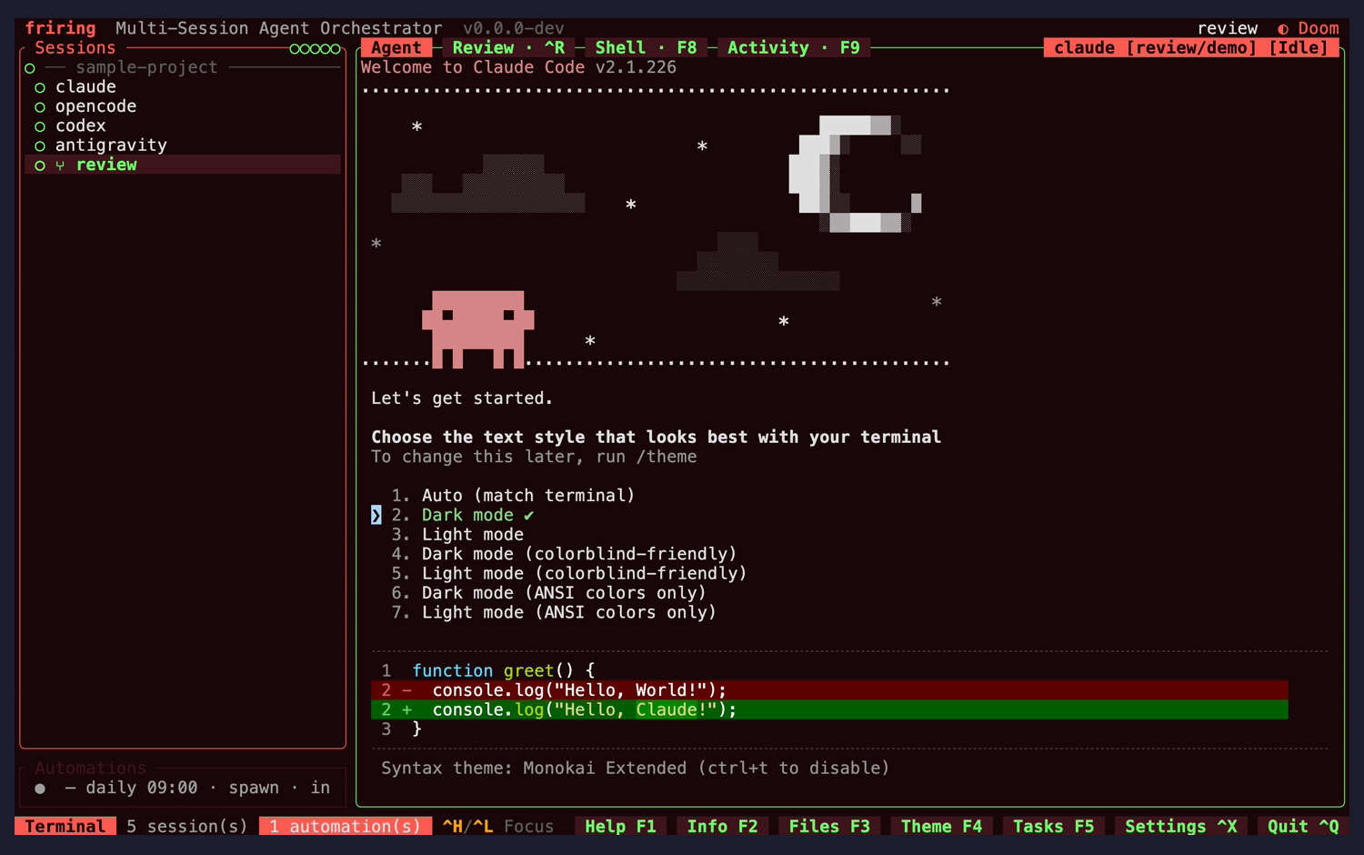
Session list + terminal (default view) launch
nit
Footer surfaces the F-key panel alternatesusability
The bottom bar spells out Help·F1, Info·F2, Files·F3, Theme·F4, Tasks·F5, Settings·^X and Quit·^Q, so a user whose terminal has focus — where the Ctrl panel chords pass through to the agent — still has a discoverable route into every panel.
Fix: No change needed; noted as a strength that offsets the terminal-passthrough discoverability gap.
nit
Automations summary is cut off at the sidebar edgevisual
The bottom-left Automations line renders as "— daily 09:00 · spawn · in" with the actual next-run value clipped off the right edge of the narrow column.
Fix: Middle-truncate the summary so the "in <time>" tail survives, or drop the cadence text when the column is tight.
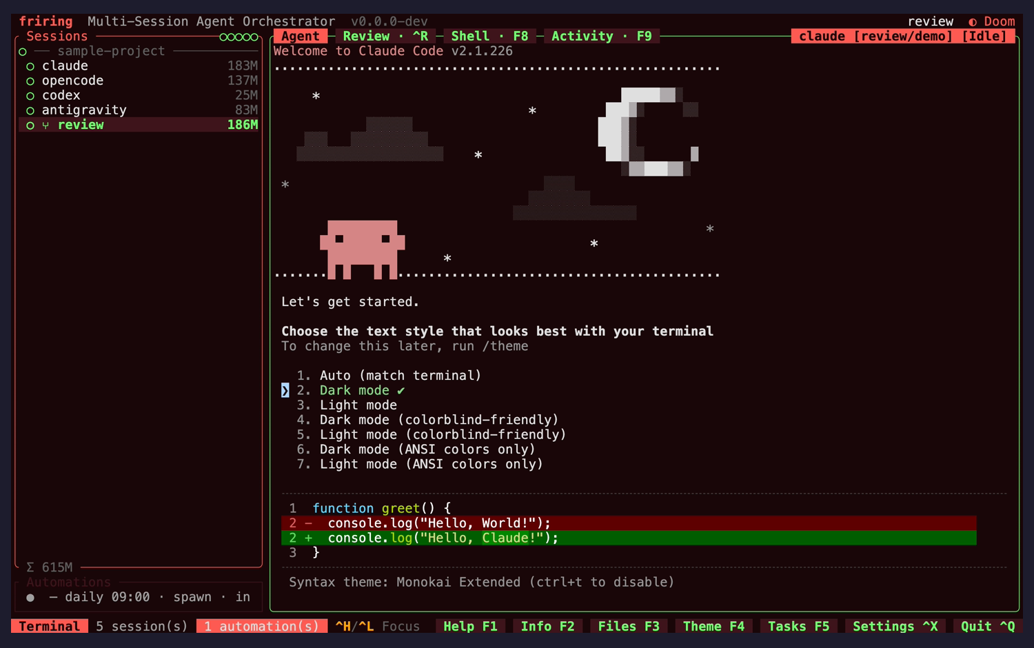
Per-session memory column populated (Σ fleet total) after first RSS scan
nit
Memory column and Σ total read cleanly against the session namesvisual
Once the first scan lands, each row gains a right-aligned RSS figure (183M / 137M / 25M / 83M / 186M) and the list foot gains "Σ 615M". The numbers sit dim next to bright session names, so the column adds information without competing for attention.
Fix: No change needed. Note that this capture was intended to show a different session selected: Ctrl+J was swallowed by the focused terminal (documented behaviour — Alt+J is the in-terminal alternate), so the frame differs from the previous one only by the memory column.
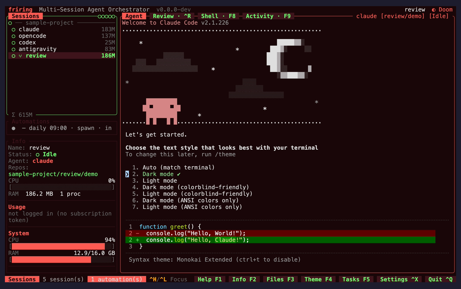
Session info panel Ctrl+B
nit
Long values still wrap raggedly in the narrow Info columnvisual
"not logged in (no subscription token)" wraps across two lines and the "Repos:" label sits on its own line with the value beneath it. Density is otherwise strong — Name / Status / Agent / Repos plus per-session and system CPU/RAM gauges and an automations countdown all fit.
Fix: Let the value use the full column width (label above, value indented), or abbreviate the usage string. Low priority.
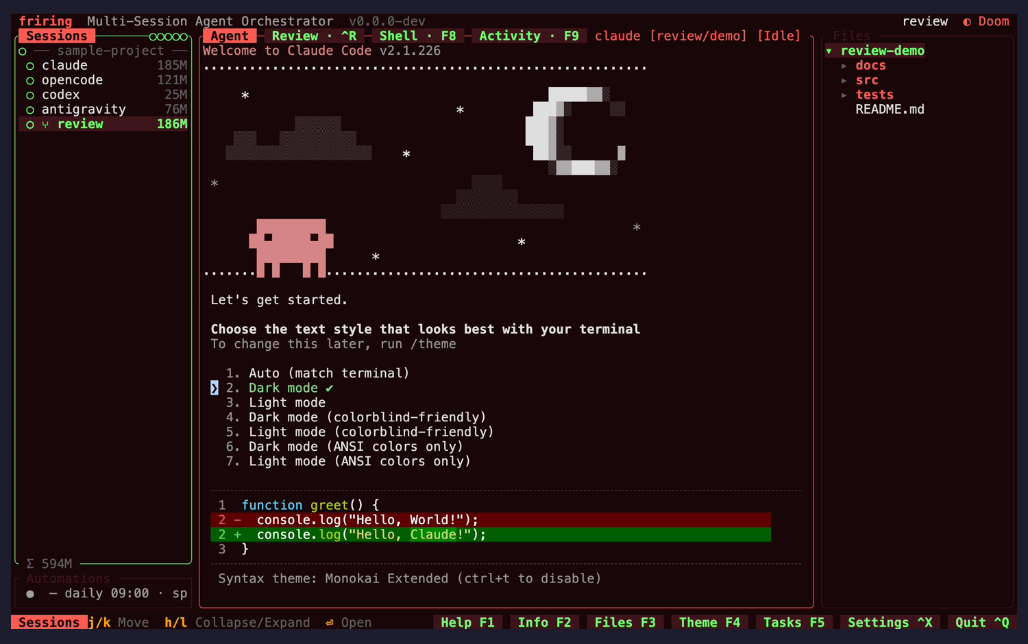
File viewer (repo tree) Ctrl+E
nit
Directory markers and a context-specific hint rowconsistency
Directories carry ▸ expand markers and the footer swaps to file-viewer hints (j/k Move · h/l Collapse/Expand · Open), matching how the other focusable panes announce their scoped keys.
Fix: No change needed.
Tasks panel (todo list) Ctrl+W
nit
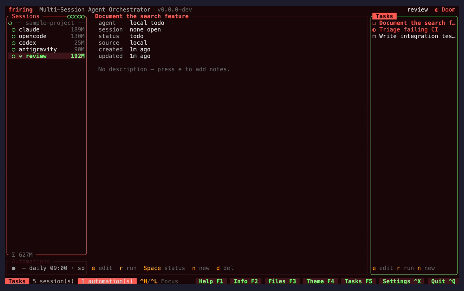
Task detail uses a fifth of its pane and leaves the rest emptyvisual
The detail view renders a six-row metadata block (agent / session / status / source / created / updated) plus one empty-state line at the top of a full-height column; roughly 600px below it is blank.
Fix: Give the description region the leftover height (it is where notes render once present), or dock the detail block so the empty state is not framed by an empty pane.
nit
Empty-state copy teaches the keyusability
"No description — press e to add notes." explains the empty state and the relevant key in one line, and the full task title shows in the detail pane even though the right-hand rows truncate it.
Fix: No change needed — a pattern worth reusing in the other empty states.
nit
Task status carries shape as well as colouraccessibility
Todo, in-progress and done use distinct glyphs (□ / ◐ / ☑) alongside colour, so status survives a monochrome or colour-blind reading.
Fix: No change needed.
Automations pane Ctrl+P
nit
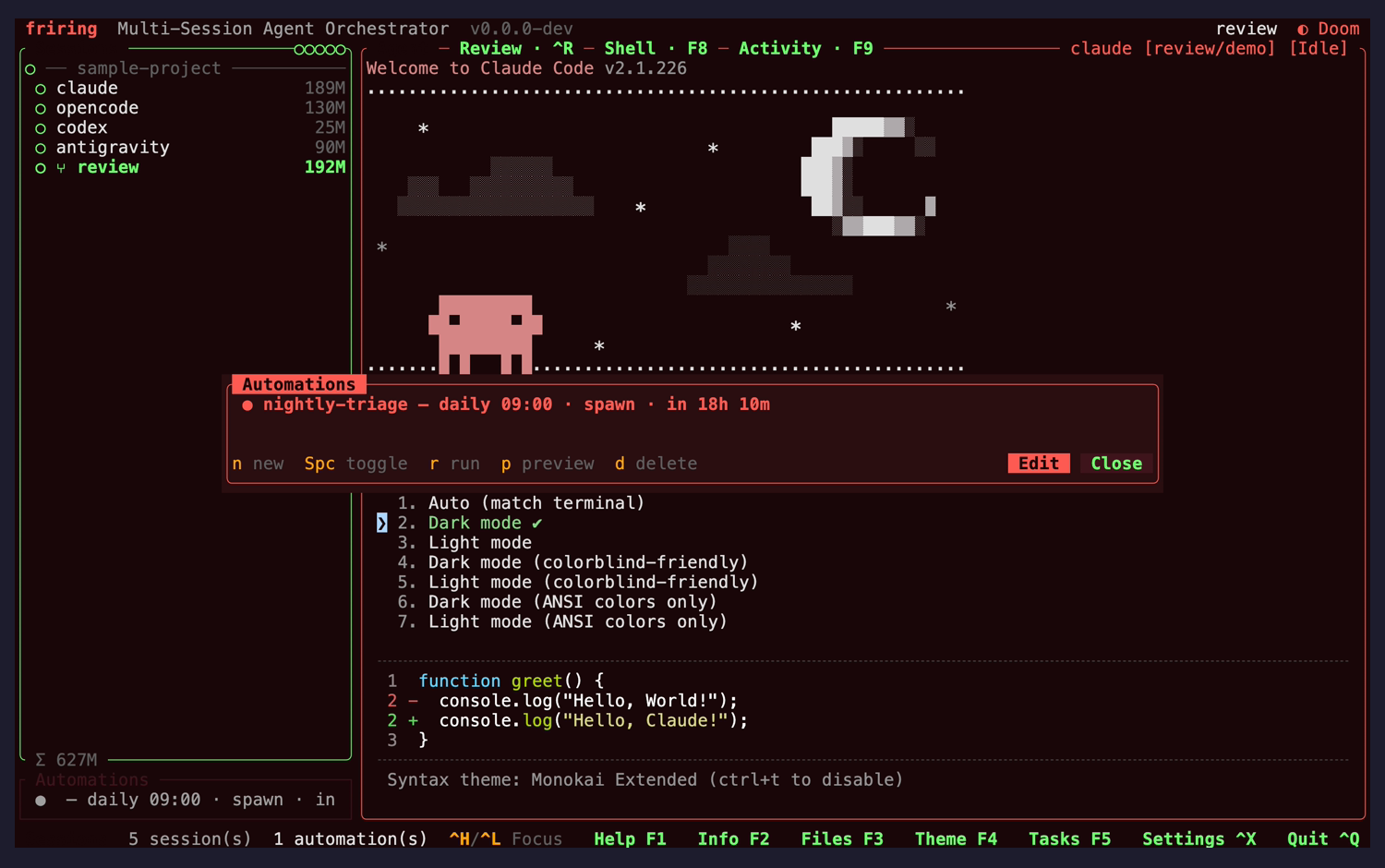
Schedule summary is scannableusability
"nightly-triage — daily 09:00 · spawn · in 18h 10m" packs name, cadence, action kind and next-run into one line, and the modal carries the same Edit/Close pill pair as the other overlays.
Fix: No change needed.
Global search popup Ctrl+/ + query
nit
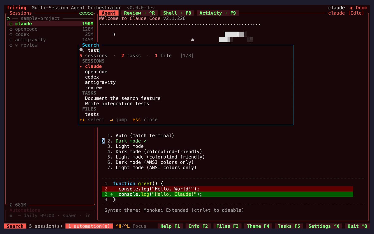
Session hits give no reason for matchingusability
Querying "test" reports "5 sessions · 2 tasks · 1 file" and lists all five sessions, none of whose names contain the query — they matched on live terminal-buffer content. The task and file rows show the matched text; the session rows show only a name, so the strongest matches look like noise.
Fix: Render a short buffer snippet (or a "matched in terminal" tag) under a session row that matched on content rather than on name, branch or cwd.
nit
Per-scope counts and grouped results give strong feedbackvisual
The header line carries per-scope counts and a [1/8] position, results are grouped under SESSIONS / TASKS / FILES headers, and the footer states ↑↓ select · ↵ jump · esc close.
Fix: No change needed.
Theme picker Ctrl+Y
nit
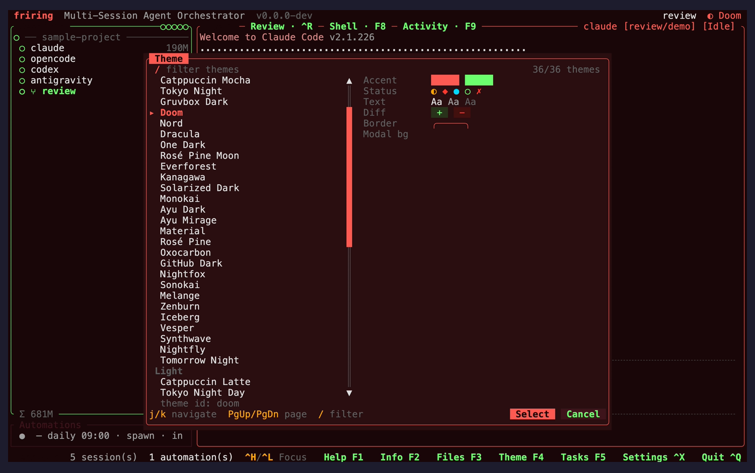
Border and Modal-bg preview chips are still nearly invisiblevisual
The preview column renders Accent as filled swatches and Status as glyphs, but the Border row shows only a thin outline and Modal bg shows nothing legible, so two of the six preview rows read as empty. Unchanged since the previous run.
Fix: Render Border and Modal bg as filled chips like Accent, so the whole palette previews at a glance.
nit
Dark and light themes are sectioned, counted and filterableusability
The picker states "36/36 themes", offers a / filter and PgUp/PgDn paging, and groups the eight light palettes under a "Light" divider after the twenty-eight dark ones, so the list stays navigable at that length.
Fix: No change needed.
New-session / repo picker Ctrl+N
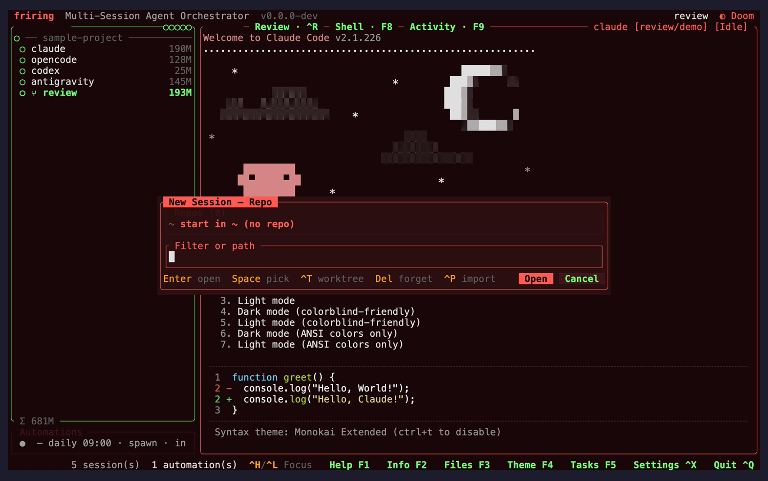
nit
"Repos (0)" section label is near-illegibleaccessibility
The list's section label renders dark-grey on the dark modal fill, far dimmer than the "New Session — Repo" title directly above it, so the count that tells you the list is empty is the hardest text in the modal to read.
Fix: Use the same dim-but-legible tone the automation editor gives its field labels.
nit
Footer hints no longer collide with the action pillsvisual
"Enter open · Space pick · ^T worktree · Del forget · ^P import" clips cleanly to the left of the Open/Cancel pills with a gap, confirming the earlier footer-overlap fix still holds at this width.
Fix: No change needed.
Repo picker: path-completion mode Ctrl+N then ~/
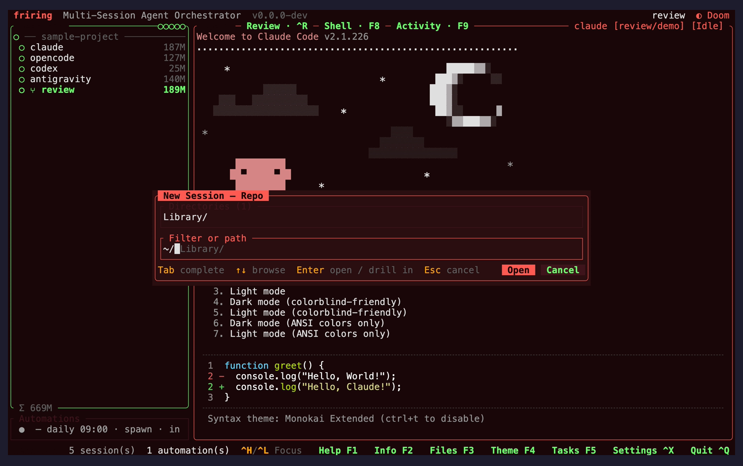
nit
Inline ghost completion with a mode-specific footerusability
Typing a path switches the footer to "Tab complete · ↑↓ browse · Enter open / drill in · Esc cancel" and shows the completion as dimmed ghost text after the cursor, so the suggestion is visibly distinct from what was typed.
Fix: No change needed. The "Directories (1)" heading has the same low-contrast problem as "Repos (0)" above.
Keybindings help + editor Ctrl+G / F1
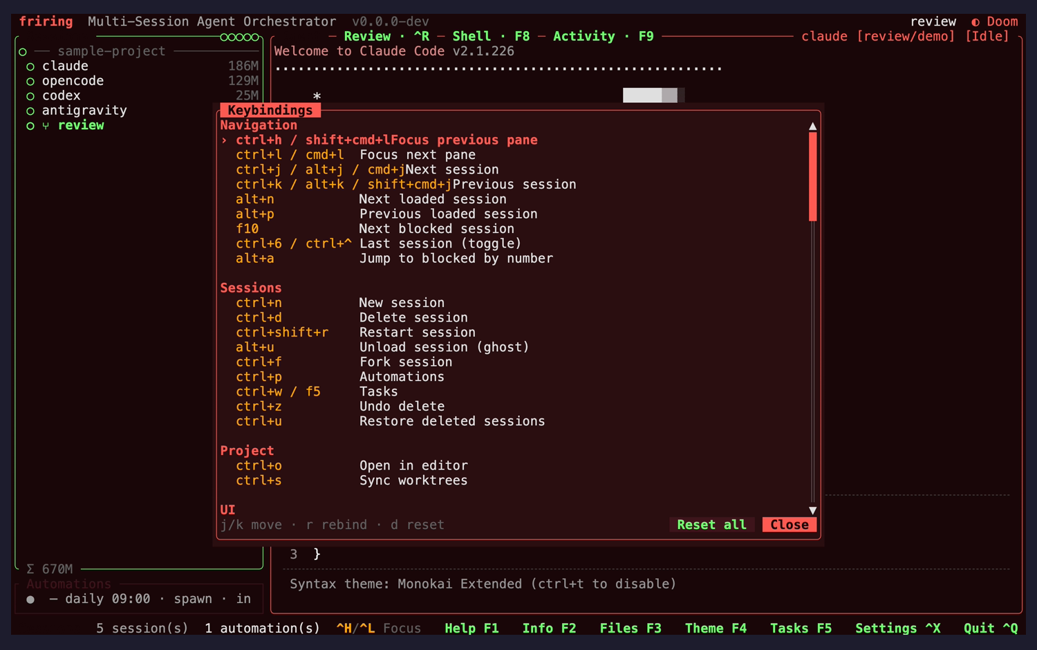
warning
Long chord lists run into the action column with no gapvisual
Rows whose chord list is wide collide with the description: "ctrl+h / shift+cmd+l" is followed immediately by "Focus previous pane", and the next-session and previous-session rows do the same. Rows with short chords ("ctrl+l / cmd+l Focus next pane") align correctly, so the description column is at a fixed offset that wide chords overrun.
Fix: Size the chord column to the widest entry, or clip it with an ellipsis at a fixed budget, and start descriptions one column past it.
nit
Grouped, scrollable and rebind-readyusability
Bindings are sectioned (Navigation / Sessions / Project / UI) with a scrollbar, a marked selected row, and a footer describing the live-rebind workflow (j/k move · r rebind · d reset) next to Reset all / Close.
Fix: No change needed; slightly heavier section headers would speed scanning.
Settings panel Ctrl+, / F6
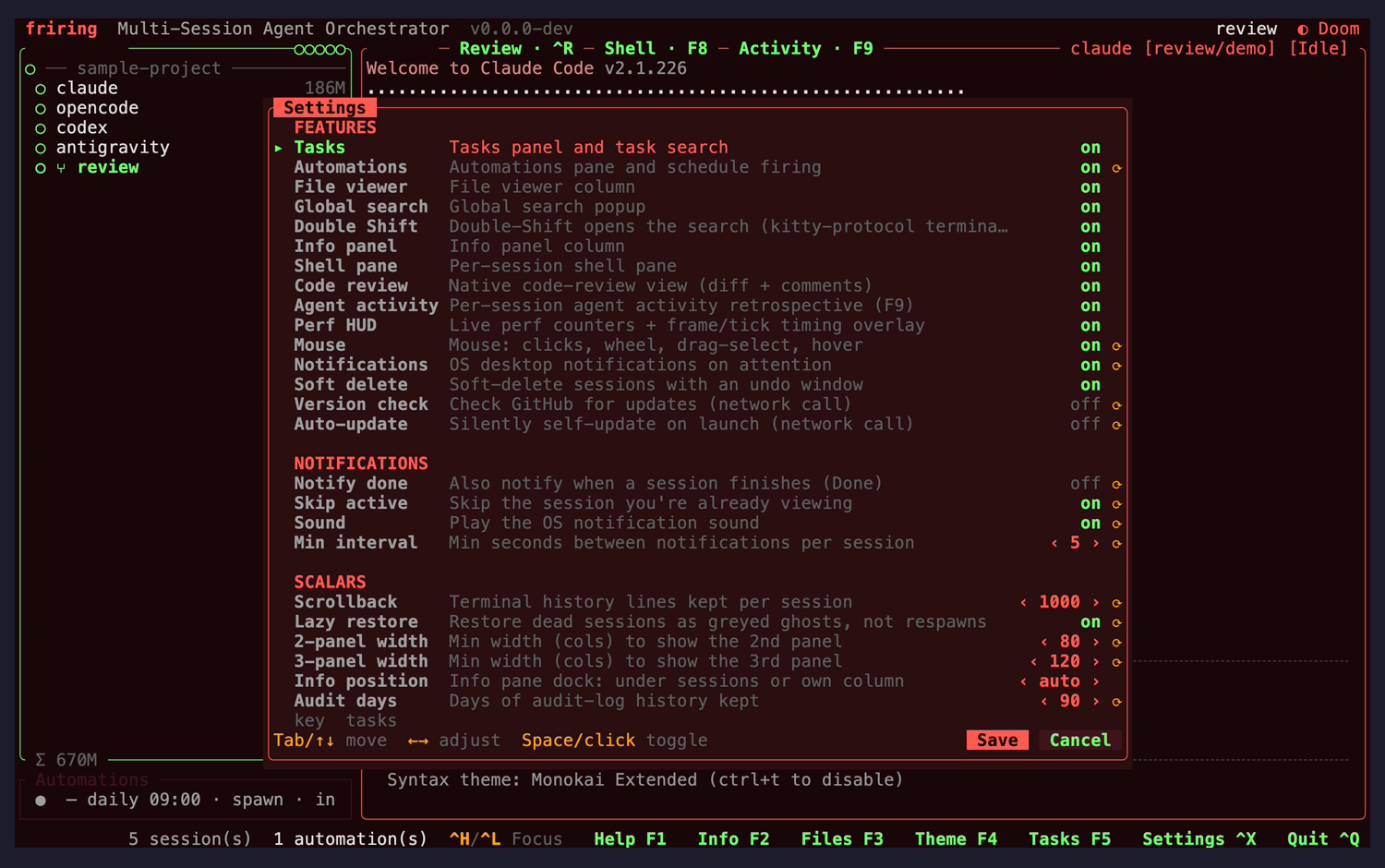
nit
Descriptions render in full and the restart marker is legiblevisual
At this width the modal widens enough that every feature and notification description renders complete, and the ↻ restart-required marker uses a bold accent tone rather than near-invisible grey. Only the Double Shift row still clips ("…kitty-protocol termina…").
Fix: No change needed — confirms the earlier truncation and marker-contrast fixes. Middle-truncating the one over-long description would close the gap.
nit
A partial row bleeds under the footer hintvisual
Below the last SCALARS row a fragment reading "key tasks" renders directly above the "Tab/↑↓ move" hint line — the next scrolled row painted into the footer's band rather than being clipped at the list boundary.
Fix: Clip the scroll viewport to whole rows so a partially-scrolled row cannot paint over the footer.
Code-review view: diff + changed-files column Ctrl+X
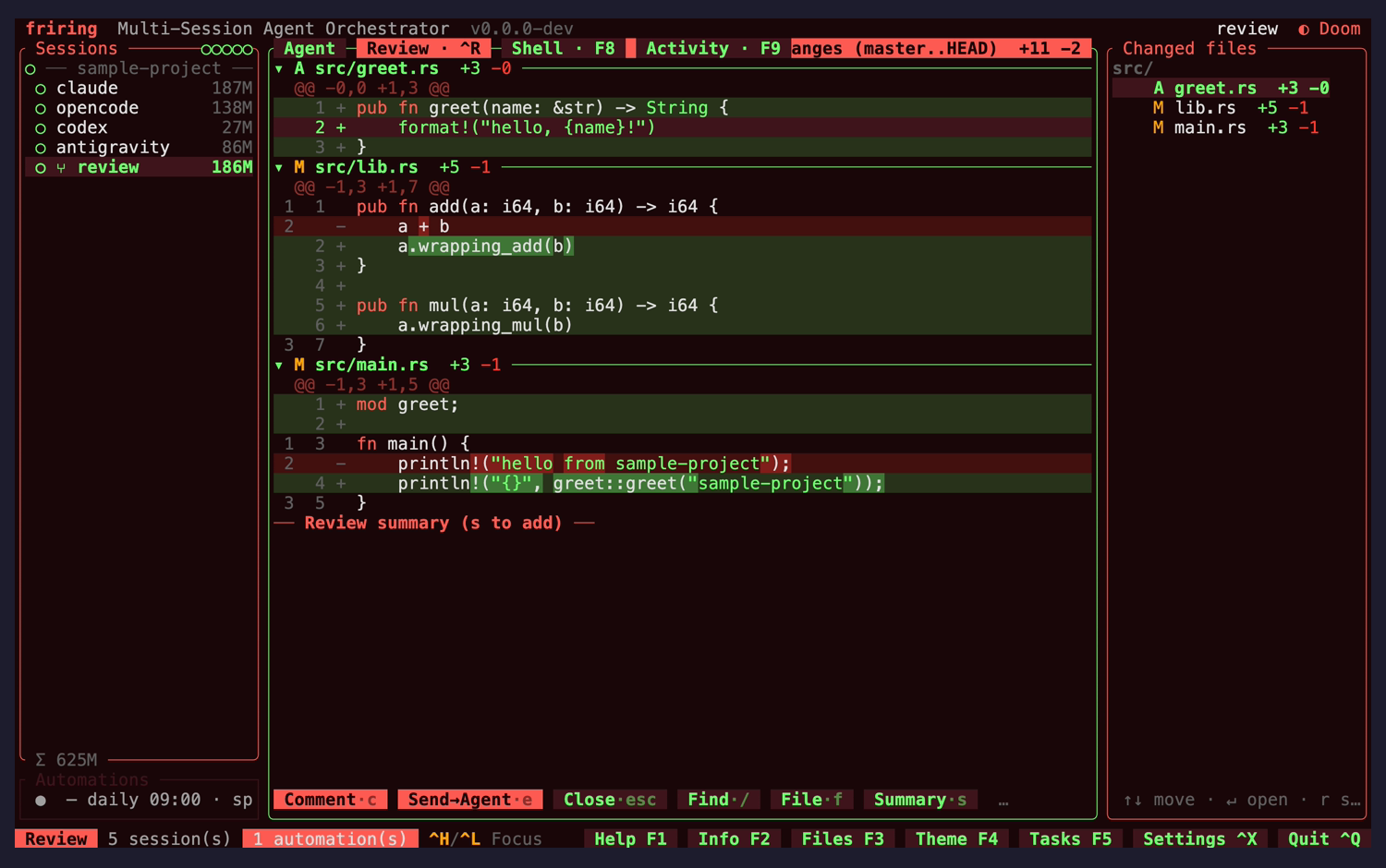
warning
Review target summary paints over the view-tab stripvisual
The top row reads "Agent — Review · ^R — Shell · F8 ▌ Activity · F9" followed with no separator by "anges (master..HEAD) +11 −2": the target summary starts inside the tab strip and its first characters ("Ch" of "Changes") are overwritten. It recurs in every code-review capture, so it is the view's default appearance, not a transient.
Fix: Reserve the tab strip its own width and clip or elide the target summary into the remainder — the same approach render_hint_action_footer already uses to keep picker footers off their action pills.
nit
Dense, well-structured diff presentationvisual
Per-file headers carry status letters and +/− counts, hunks are syntax-highlighted with word-level intra-line highlights on the changed spans, and the mirrored Changed-files column repeats the same counts under a src/ tree node.
Fix: No change needed.
Code review: inline comment compose + classification c
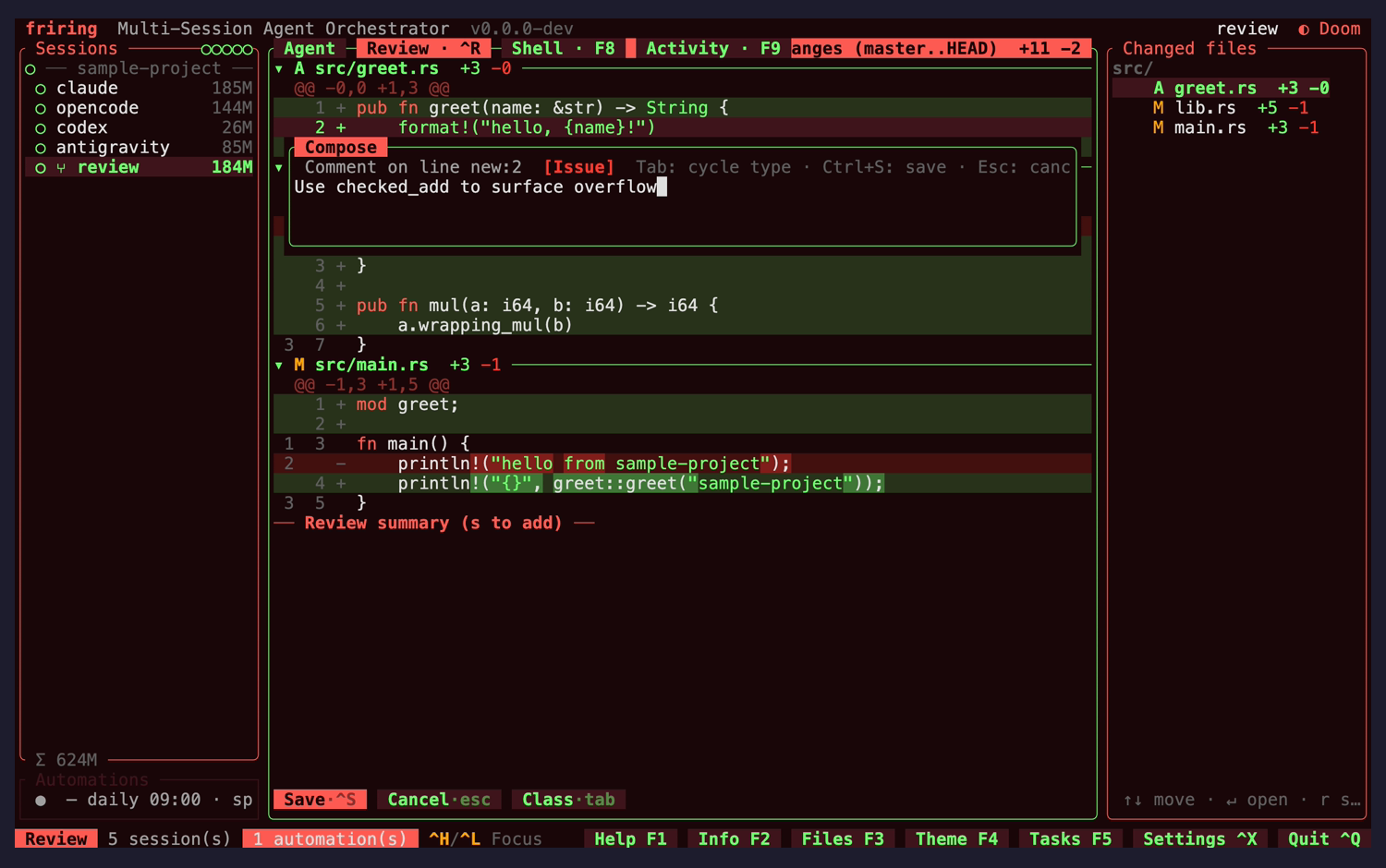
nit
Compose header truncates its own key hintsvisual
The header reads "Comment on line new:2 [Issue] Tab: cycle type · Ctrl+S: save · Esc: canc" — the last hint loses its final characters at the box edge.
Fix: Drop the "Esc: cancel" hint when the header does not fit (the Cancel·esc pill in the footer already carries it) rather than clipping mid-word.
nit
Classification is visible and cyclable in placeusability
The active class shows as a coloured [Issue] tag in the compose header with Tab named as the cycle key, and the footer swaps to Save·^S / Cancel·esc / Class·tab while composing.
Fix: No change needed.
Code review: side-by-side diff layout v
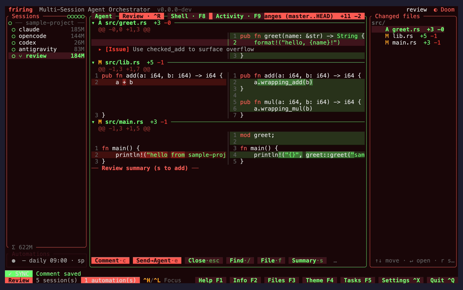
warning
Long lines are clipped mid-token with no ellipsisvisual
In the split layout the columns cut code at the boundary — "println!(\"hello from sample-proj" and "greet::greet(\"sam" — with no trailing ellipsis and no horizontal-scroll affordance, so a truncated line is indistinguishable from a short one.
Fix: Append "…" to any clipped row, and consider a soft-wrap continuation row so the tail stays reachable without leaving the layout.
nit
A saved comment renders detached from its anchorconsistency
The "▸ [Issue] Use checked_add to surface overflow" row renders in the left (old) column while the line it anchors to is on the right (new) side, so the visual link between comment and code is lost in split view.
Fix: Render an anchored comment on the side its anchor line lives on, or span it across both columns as a full-width row.
Code review: target picker (branch / working / staged / commit) t
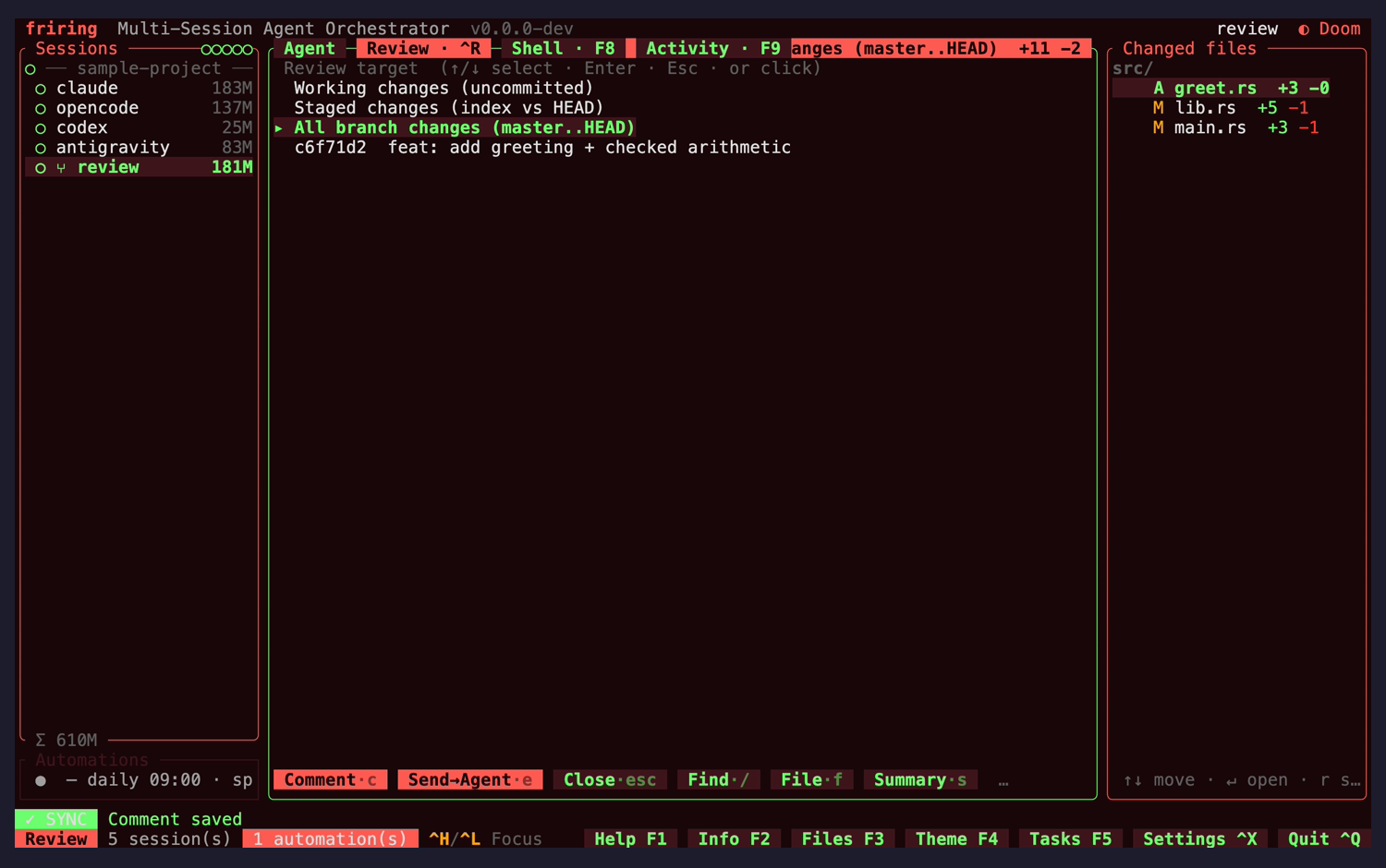
nit
Picker instruction line is the dimmest text on the screenaccessibility
"Review target (↑/↓ select · Enter · Esc · or click)" renders dark-grey on the dark fill, noticeably below the four selectable rows beneath it — the same low-contrast treatment as the repo picker's section labels.
Fix: Raise it to the shared dim-label tone so the instruction is readable at a glance.
nit
All four targets are offered with the commit subject inlineusability
Working changes, staged changes, all branch changes and the individual commit each get a row, with the commit showing its short SHA and subject, so picking a target needs no prior git knowledge.
Fix: No change needed.
Automation editor (multi-step prompt) Ctrl+P then Enter
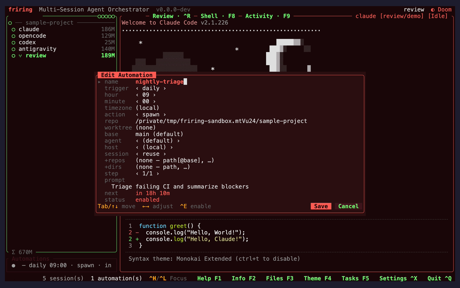
nit
Dense field list with the schedule resolved in placevisual
Seventeen fields fit one screen with dim labels against bright values, ‹ › markers on the adjustable ones, a step counter, and a resolved "next: in 18h 10m" plus "status: enabled" at the foot — so the effect of an edit is visible without a dry run.
Fix: No change needed.
nit
Repo shows as a full absolute pathvisual
The repo row renders the whole path; at a narrower width, or with a deeper path, it will be the first field to overflow its column.
Fix: Middle-truncate the path so the repo leaf stays visible, matching the truncation rule suggested for the sidebar summaries.
Task editor (in-pane) Ctrl+W then Enter
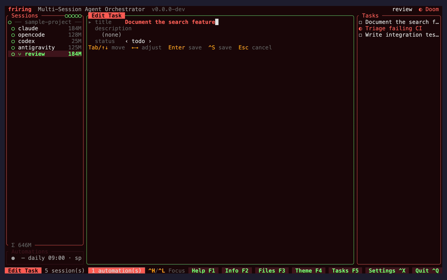
nit
Hint row sits at the top of the pane, unlike every other editorconsistency
The Tab/↑↓ · ↔ · Enter · ^S · Esc hint line renders directly beneath the three fields at the top of the pane, whereas the automation editor, settings modal and both pickers all dock their hint row at the bottom of the frame.
Fix: Dock the hint row at the foot of the editor pane so the footer's position is the same everywhere.
nit
Three fields occupy an eighth of a full-height panevisual
Title, description and status render in about 110px of an ~830px column and the remainder is empty, even though the description field is the one that would benefit from the space.
Fix: Expand the description field into the free height, so editing notes does not need a separate step.